We recently had the privilege of contributing to the 50th anniversary campaign for Elton John’s ‘Captain Fantastic’, celebrating a landmark moment in the legacy of one of music’s most iconic storytellers. To honour the album, we created a variety of Spotify canvases, 3D and 2D unboxings, a lyric video, and cutdowns to promote across socials. 

Our Senior Project Manager, Charlotte, shares her thoughts on working across the project: “Collaborating with UMR on the 50th Anniversary Edition of ‘Captain Fantastic’ and ‘Brown Dirt Cowboy’ was an incredible experience. As project manager, the campaign oversaw the creation of lyric videos, 3D product animations, and a full suite of promotional assets that helped reintroduce this iconic Elton John album to both longtime fans and a new generation of listeners.”

Our Junior Designer, Joni, adds her take from the design POV: “Working on ‘Captain Fantastic’ and‘Brown Dirt Cowboy’ as one of the designers was such a wonderful experience. From product animations to album visuals, it was an honour to help bring the campaign to life from start to finish through motion and design.”

The team were fortunate to receive an invite to the Captain Fantastic listening party, where we sat alongside long-time fans of the album and the artist for a deeply immersive listening experience.

Got a brief for us? Get in touch, we’d love to help you spark your next great idea!

Working with F That means stepping into a creative space where legacy and innovation genuinely coexist. One day, the team is honouring the history, depth, and visual worlds of iconic artists with decades of cultural imprint; the next, they’re shaping bold, future-facing campaigns for frontline chart-toppers who are defining what music looks and feels like right now. 

This helps keep the work electric, adaptive, and deeply connected to every corner of the industry, so we can move seamlessly between heritage and hype without ever losing its creative edge.

We recently worked on the campaign for ‘Gone Gone Gone’, the new single from Teddy Swims, David Guetta, and Tones and I; a perfect example of the kind of high-energy, frontline projects that keep our team buzzing. We created an advanced lyric video for the single and some short-form content to tease the asset across socials. 

Our Senior Designer, Shannon, shares her experience working on this high-profile project: “I had the opportunity to create the lyric video for ‘Gone Gone Gone’ by Teddy Swims, Tones and I & David Guetta. From the very start, the process was incredibly smooth. Everything was clearly laid out, making it easy to jump straight into the creative. As a Senior Designer, it’s always rewarding to see a project grow from ideation to execution, and having the creative freedom to shape the look and feel of this piece made the experience even better.”

Got a brief for us? Get in touch, we’d love to help you spark your next great idea!

Designers have always looked for new ways to push ideas further, and now, AI is becoming part of that creative conversation. At F That, we’ve been exploring what that balance looks like. As AI tools evolve at lightning speed, our design team has leaned into curiosity over caution, experimenting with platforms and trialling the outcomes. Whether you’re an avid AI user or not, keeping up to date with it is crucial – it’s one of those “if you can’t beat ‘em, join ‘em moments. 

Our Senior Designer, Shannon Conway, has been leading that charge as our unofficial AI Ambassador, staying ahead of emerging tools and sharing weekly intel with the team to keep our creative workflows evolving. 

As Shannon continues to explore how AI can make the early stages of design more fluid without losing that essential human touch, she shares her insights so far.

How do you see AI changing the role of designers – is it a threat, a tool, or something else entirely?

I see AI as a tool, not a threat, but it’s a game-changer for how we approach projects. It definitely doesn’t replace the designer’s eye or storytelling instinct. For example, I use AI to build base layers or expand concepts quickly, but the final polish still comes from me. The “human touch” is what gives any piece of work its depth and authenticity.

What are your go-to AI tools right now, and how do they fit into your creative process?

At the moment, I frequently use Google Flow with VEO Gen 3. We’re testing its capabilities, but so far it’s been excellent for generating quick concepts and bringing still images to life. After using AI to explore or create initial visuals, I always bring the projects into After Effects to refine, animate, and ensure everything feels cohesive and not too “Ai-y”.

What excites you most about where AI design tools are heading?

I’m most excited about how much smarter and more integrated AI tools are becoming. The idea of real-time, adaptive generation, where you can test motion, tone, and layout variations instantly, could open up a new level of creative experimentation. It feels as though we’re still at the early stages, and there’s so much more potential for AI to improve storytelling and production flow without losing that human creativity.

What skills will become more important for designers as AI continues to evolve?

There seems to be a new development in AI every day, so I think understanding its capabilities and limitations is a crucial point to learn. That way, we can leverage AI tools effectively in our design process and make informed decisions about when and how to use them.

How can teams foster a healthy relationship between human creativity and machine efficiency?

By framing AI as a collaborator rather than a shortcut. It’s about creating space for both: letting AI handle the repetitive or time-consuming parts, so designers can focus on storytelling and quality. Encouraging open discussions around AI use, sharing workflows, and experimenting together helps teams keep that balance between efficiency and originality.

At F That, our approach isn’t about chasing trends or automating creativity; it’s about designing with intelligence. As Shannon puts it, AI works best when it acts as a collaborator, not a competitor. It’s an amplifier for imagination rather than a replacement for it.

AI might be changing the way we work, but it isn’t totally reworking design itself; curiosity, storytelling, and problem-solving still sit at the heart of every great idea, with human heart and creativity driving it all.

Blog Tester: How to Write a Good Brief

Article by: Grace Stewart-Ricketts

Read Time: 3 Minutes

In the short but vibrant seven months since joining F That as a Junior Project Manager, one truth has stood out like a neon sign: a good brief can make or break a project. It’s the difference between smooth sailing and a chaotic whirlpool of revisions.

A solid brief isn’t just paperwork; it’s a shared vision. When everyone understands the “what,” “why,” and “how,” magic happens – deadlines are met, creativity thrives, and everyone actually has fun working on it.

So, to save you from the dreaded “quick amendment” loop, we’ve pulled together our ultimate Crash Course in Writing the Perfect Brief.

Why a Good Brief Matters

  • Clarity saves time: Clear objectives mean fewer misunderstandings.
  • Direction builds confidence: When creatives know exactly what’s expected, they can focus on innovation instead of interpretation.
  • Consistency strengthens brand voice: A well-documented tone and message keep your project on track.

What Every Strong Brief Should Include

  • Purpose: What are we trying to achieve?
  • Audience: Who are we talking to?
  • Tone and style: Should it feel bold, playful, or refined?
  • Deliverables and deadlines: Be specific. Vagueness kills momentum.
  • References: Provide visual or written examples to illustrate your vision. We always recommend taking a look at our portfolio, or browsing our Instagram to get an idea of our styles and specialities.
  • Pick up the phone ☎️ : Unsure as to what you’re looking for? We’re always keen to help. A simple call can go a long way- don’t be shy!

A Picture Paints 1,000 Words

Don’t just tell…show! Include mood boards, screenshots or previous campaigns that embody your vision or lend some inspiration to the direction of your ideas. Did you watch something that piqued your interest? Is there something similar that caught your eye? 

Though the F That team is dedicated to delivering exceptional content whatever the weather, putting together an informative brief is just one way that you can help us to help you get the best results quickly and efficiently. 💫

F-That How to write a good brief

Article by: Grace

Read Time: 8 Minutes

This is the post.

  • Here
  • Here
  • HEre


A Chat With F That: Frank Maddocks

Article by: F That

Read Time: 3 Minutes


Since purchasing a copy of Deftones’ ‘Adrenaline’ in 1995, Frank Maddocks has forged an enduring creative relationship with the band that has redefined the imagery surrounding their sound

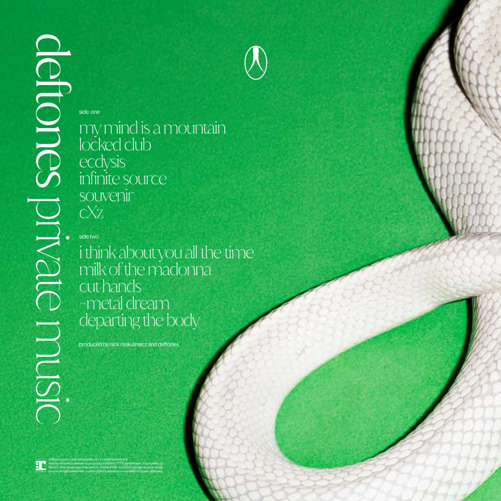
Over 25 years of trusted collaboration and art direction, Maddocks has continually pushed boundaries, with his latest project, an album cover for ‘private music’, standing as a testament to his distinctive and evocative vision.

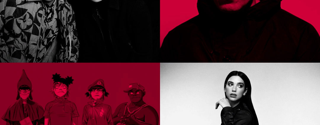
As an agency, we’ve had the privilege of bringing several of Maddocks’ album artworks to life through animation, including those for Deftones and Linkin Park. In this debut A Chat With F That feature, we’re diving deeper into his creative process and exploring the inspirations behind these iconic works.


How did you start developing the art concepts for ‘private music’?

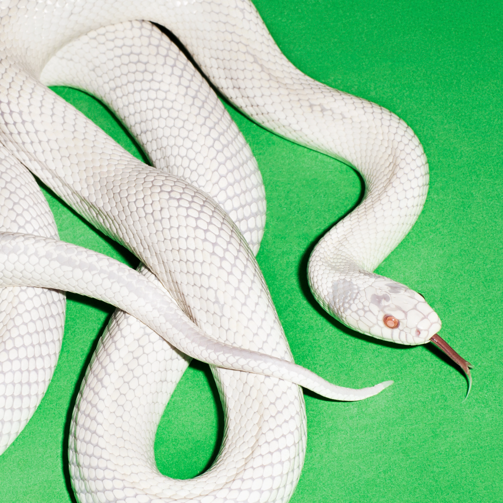
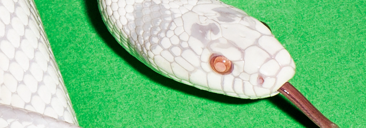
The album cover exploration and design process for private music started without having heard music or receiving distinct direction or ideas for focus from the band. I began creating a collection of potential approaches and visuals to present to the band. Earlier in the year I received a batch of visual references from the band in regards to potential merchandise designs that contained a few images of snakes among other imagery. The image of a snake resonated with me on a subconscious level.

Are there any feelings, words or concepts that underpin the creative vision of this album cover?

First and foremost, I wanted to create something true to Deftones’ left-of-center aesthetic we have developed. I knew that I wanted to make something bold, vibrant, memorable, unexpected, contemporary, iconic, unique and visually distinct from anything in the marketplace, strong and confident. Artistically, I wanted to make something that was free of layered digital techniques or trendy filters and gimmicks. I wanted a strong singular image.

What was it like moving from being a fan to actually shaping Deftones’ visual identity?

When I began work for ‘White Pony’ in 2000 (my first album working with the band) I was both elated and nervous to have been awarded the task. Not only did I want to create amazing work for a band I cared about, but this was also my first major album design project and a highly anticipated release from the band. Being a fan gave me the desire to strive for excellence and becoming closer to the band throughout the years continues to fuel my passion to make great art with them. To me, it’s surreal at times that I get to create imagery with such an impactful artist and I don’t take any of this for granted.

Where do you usually turn for inspiration when starting a new project?

If an artist doesn’t have a specific direction or goals when beginning a project, I turn to aesthetic directions that are interesting to me at the time, different from what I have created in the past or artistic directions that I have been wanting to explore. Also styles I’m interested in, or haven’t executed.

Do you begin with the music, or does the artwork sometimes lead the way?

Sometimes I’m able to have a studio visit with the artist or receive a link to hear music. It’s always inspiring to hear the music before diving into a project as it helps to set the tone and vibe. Many times I’m not hearing music until I’m in the process of developing art. Throughout the years there has been remarkable unexpected synergy between the music and visuals.

You’ve also worked with Linkin Park, how does your approach shift between bands with such distinct sounds?

If there is an idea of focus from the artist on direction, that starts the process in a unique way. If I’m being called on to deliver concepts, it all starts with creating art that is true to the individual artist. The approach to album art has to be unique and distinct. Although I bring many of my personal style references and aesthetic goals to the process, I strive to keep the visuals between artists different.

What’s the secret to your longevity when working with these bands across so many albums?

Through thoughtful consideration, hard work, dedication and the desire to create intriguing visuals for Deftones and Linkin Park, I have developed trust, understanding and insight into their sonic and visual worlds.

Throughout the years we have developed a great working relationship and they know that I want the best for them and will always push the creative boundaries of our work together. I continue to dedicate intense focus to the creative for my artists. You can’t rest. You can’t become complacent or settle. As an artist, I’m always looking to exceed my previous work. I am grateful for the trust they have in me and the appreciation for our work together.